Designing Glean for accessibility – screen reader, color schemes, & more


Previously, in part one of our accessibility series, we discussed the importance of developing products with accessibility in mind from the very beginning, our guiding principles for accessibility, along with our efforts to improve the focus and shortcut systems in Glean.
In this blog, we’ll be exploring more accessibility improvements and features – particularly our screen reader experience, our approach to color schemes, and responsive design.
Improving the screenreader experience
Screen readers can assist visually-impaired users to navigate the web. It resembles navigating with shortcuts, with the addition of a voiceover telling users what they are interacting with. What makes a screen reader particularly useful is that it already supports many keyboard shortcuts natively, assuming the developer uses the correct semantic/markup for their UI.
Let’s take VoiceOver (the default screen reader of macOS) and its shortcuts as an example:
<ul type='disc'>
<li> All the arrow keys mentioned above should work out of the box with VoiceOver. <ul type='disc'>
<li> E.g. by correctly using an <span class="text-rich-text-code" style="font-family: monospace;">ul</span> element (or <span class="text-rich-text-code" style="font-family: monospace;">role="list"</span>) to present a list, a screen reader user can use [VO] + [Option] + [Left/Right] key to navigate through the list items </li>
<li> Similarly, they can use [VO] + [Left/Right/Up/Down] key to navigate through a table, similar to how we implemented it </li>
</ul>
</li>
</ul>
When optimizing screen reader functionality, we found it useful to take these factors into account:
1) Pick the right element for the job
- Always employ the semantically appropriate element for your UI. For example, use a native HTML <span class="text-rich-text-code" style="font-family: monospace;"><button></span> instead of a custom <span class="text-rich-text-code" style="font-family: monospace;"><div></span>. Use <span class="text-rich-text-code" style="font-family: monospace;">table</span> (along with <span class="text-rich-text-code" style="font-family: monospace;">tr</span>, <span class="text-rich-text-code" style="font-family: monospace;">th</span>, etc...) instead of nested <span class="text-rich-text-code" style="font-family: monospace;">div</span>.
- Picking the right element, as demonstrated earlier, greatly benefits the screen reader by enabling it to automatically understand the UI functionality. It can then provide correct voiceover descriptions and the appropriate shortcuts.
2) When in doubt, provide explanation
<ul type='disc'>
<li> The more visually-heavy the content is, the more information that should be tagged along with it in order to make it accessible for visually-impaired users. Even for non-impaired users, we cannot assume that they will infer the exact information as the author. </li>
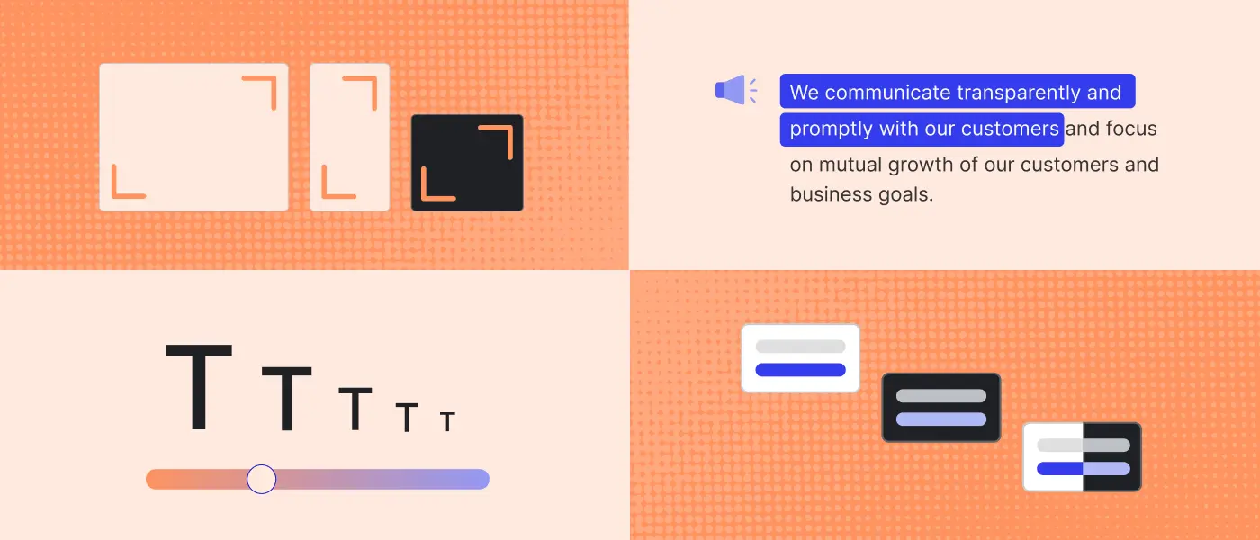
<li> A canonical example is the famous duck vs rabbit illusion. In a similar but more practical example, different users might infer the functionality of a button differently (e.g an exclamation icon could have any meaning). Having accompanying text for the image/visual will help guide the user toward its intended usage. </li>
<li> Another option is to utilize tooltips to provide helpful clues. However, it’s generally non-trivial to make tooltips accessible to a screen reader. The alternative is by using: <ul type='disc'>
<li> <span class="text-rich-text-code" style="font-family: monospace;">alt</span> attribute for <span class="text-rich-text-code" style="font-family: monospace;"><img></span>
</li>
<li> <span class="text-rich-text-code" style="font-family: monospace;">aria-label</span>, or <span class="text-rich-text-code" style="font-family: monospace;">aria-describedby</span> / <span class="text-rich-text-code" style="font-family: monospace;">aria-description</span> for other interactive elements like <span class="text-rich-text-code" style="font-family: monospace;"><button></span> or <span class="text-rich-text-code" style="font-family: monospace;"><a></span>
</li>
</ul>
</li>
<li> The above attributes allow screen readers to process and relay visual information to users. </li>
<li> Another great option is to enable users to add additional alt text / captions for images. </li>
</ul>
3) Other tips to improve the screen reader experience
<ul type='disc'>
<li> On the developer side, there’s a popular React <span class="text-rich-text-code" style="font-family: monospace;">eslint</span> plugin that helps detect semantic issues (along with providing solutions and suggestions) </li>
<li> A common pitfall is providing too much information for the screen reader, thus inadvertently overloading and degrading user experience. It’s important to provide just the necessary attributes – described concisely. <ul type='disc'>
<li> E.g: for <span class="text-rich-text-code" style="font-family: monospace;"><img></span>, don’t include ‘photos’ or ‘images’ in the alt text, since it’s duplicative (the information is already inferred by the tag name) </li>
</ul>
</li>
<li> The more complex your UI, the more semantic and markup it should employ </li>
</ul>
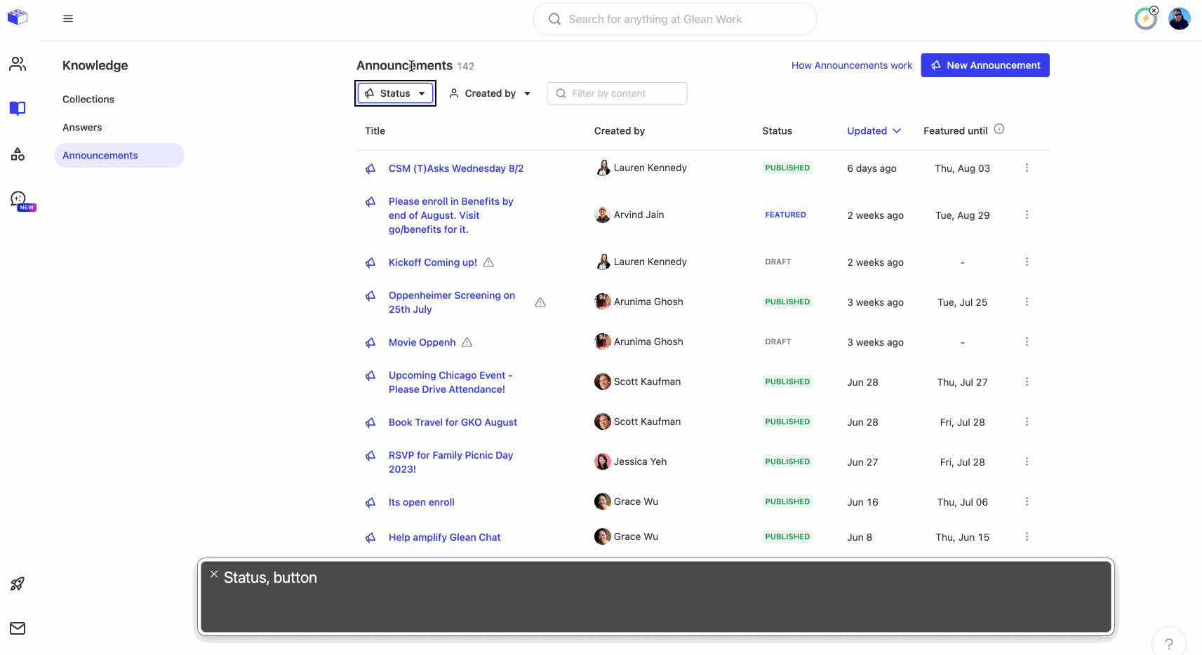
Adopting a standardized color theme
Tangentially, we also took on a few other challenges that contributed to the overall accessibility effort. One of those was standardizing our color themes across the board.
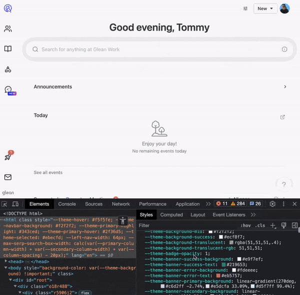
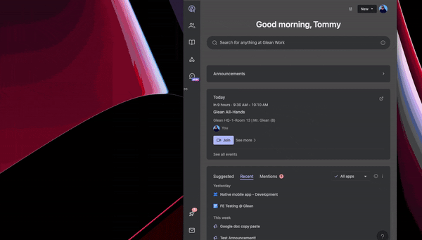
Last year, we introduced dark mode to Glean (by popular demand!). A big change was now having a "theme" (or "color palette") standardized and shared across the product. Instead of writing hex color in codes, we use a pre-defined semantic color, like <span class="text-rich-text-code" style="font-family: monospace;">primaryText</span>, <span class="text-rich-text-code" style="font-family: monospace;">primaryBackground</span>, <span class="text-rich-text-code" style="font-family: monospace;">secondaryText</span>, <span class="text-rich-text-code" style="font-family: monospace;">secondaryBackground</span>, etc. Using this semantic layer allows developers to swap between light and dark themes easily (and instantly with the use of CSS Variables, as featured in this Slack blog post).
From the accessibility perspective, we strive to make sure our color theme is AA-level compliant (which means a minimum luminance ratio of 4.5 : 1 between foreground and background). A potential idea to explore further is to introduce a high-contrast mode that users can enable to make foreground color (such as text & border color) more visible when placed against their background.
Widely adopting responsive design
For customers looking to use Glean on their mobile devices, we also support the Glean mobile app on both iOS and Android. We use Capacitor to render the web view, which mirrors the website at a small and narrow viewport (at least for most devices). We make sure to build a mobile-friendly menu and navigation UI, for ease of use and responsiveness.
From another perspective, using a product at a smaller viewport mirrors using it at a higher zoom level (i.e by using CMD + / - to adjust zoom level on your browser). This is important for accessibility because many users (without perfect eyesight) may need to zoom in to make content, such as small text, more perceptible.
As a result, we adopt responsive design and strive to make sure any new features would work well in small windows and high zoom levels. This delivers a minimum loss of functionality regardless of zoom (AA standard requires products to work well at up to 400% zoom level).
Making font size flexible
As mentioned above, customers without perfect vision may require zooming in or using a magnification tool to view the web more easily, more often on websites with small text. To adhere to this criteria, a common solution is to allow your website’s font to respect the browser’s preference by using rem.
Rem represents the page’s (root) font size, which will use the default font size (from browser’s preference). In addition it can be manually tweaked by specifying the font’s value on the root’s element (i.e the <span class="text-rich-text-code" style="font-family: monospace;"><html></span> element or using <span class="text-rich-text-code" style="font-family: monospace;">:root</span> in CSS). One thing to keep in mind when adopting rem is making sure text containers don't have fixed px height, or they should also use rem. This allows the text to not overflow outside of its containing region when enlarged.
Circling back to our “semantic” design system, we can abstractly define these font usage on the high level and share them across products. An example in LESS: instead of using <span class="text-rich-text-code" style="font-family: monospace;">font-size:16px</span>, we’d use <span class="text-rich-text-code" style="font-family: monospace;">font-size:@mediumFont</span> and define <span class="text-rich-text-code" style="font-family: monospace;">@mediumFont:1rem</span>.
Pursuing improvements
When it comes to accessibility, particularly for earlier stage companies, here’s what we’d like to leave you with:
- Leaner teams mean easier communication. Get people aligned on the same design system as soon as possible to ensure scalability
- Designing for accessibility from the start is easier than tinkering to make it work down the line
- A polished, accessible product isn’t just pretty – it genuinely stands out when speaking with prospective customers
Thanks for coming along with us! Have any inquiries or requests when it comes to accessibility? Please reach out to a11y@glean.com – and check out our public accessibility roadmap to know what we’re actively working on to bring better search and knowledge discovery into the hands of more users.
Related articles
