.webp)


At Glean, we believe in the power of evolution. Branding is more than just a logo or a color palette—it's a reflection of our mission, values, and the people we serve. Over the years, Glean has evolved from being an enterprise search tool to an AI work assistant and platform, and it was time for our brand to evolve alongside that.
We partnered with Kallan & Co. on our new branding and gathered customer feedback on the various concepts we explored. One of our customers noted that ‘using Glean is elegantly simplifying the chaos and complexity of today’s work’, a statement that’s helped us focus on what was important to display during our rebranding journey.
Today, we're excited to unveil a refreshed brand identity that encapsulates who we are now, and where we're headed.
What’s new?
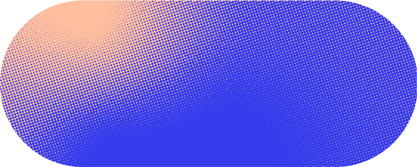
A vibrant palette
We’ve punched up our colors and introduced a vibrant and dynamic color palette that reflects the boldness of Glean’s energy and mission. From our core Glean blue to vibrant accents like bright green, pink, and orange, each hue reflects our commitment to bold, smart, and delightful user experiences.

Typography
Typography plays a crucial role in conveying our brand's personality. Our new typeface, Polysans, is a versatile and modern sans-serif typeface that perfectly balances the concepts of intellect and delight. It’s designed to be both functional and aesthetically pleasing, ensuring that our communications are clear, engaging, and reflective of our brand's forward-thinking nature.
.webp)
Visual system
We developed several brand visual elements to create a cohesive and flexible visual system that can be seamlessly applied across multiple brand channels.
Glean’s core mission is to transform raw data into clarity, distilling information from across your organization into actionable insights. We explored numerous iterations to represent this concept visually and ultimately landed on the Flow Line. This element symbolizes the synthesis of precisely what you need in seconds, guiding you from a state of ambiguity to clear, actionable insight.
.webp)
In addition to the Flow Line, we introduced the Depth Flow element, which adds extensibility and dimensionality to our visual system. This versatile element can be applied in countless ways, enhancing the visual richness and adaptability of our brand.

Illustration style
Our new illustration style is designed to be both versatile and coherent, seamlessly transitioning from detailed icons to larger, impactful visuals. A core feature of our illustration style is the opaque blur layer, which adds depth and sophistication to our visual narratives. This style ensures that our brand remains visually engaging and consistent across all touchpoints.
.webp)
Coming together
Combining all these elements, this is how some of these elements come together in our brand assets.

.webp)
%2520(1).webp)

Looking Ahead
This brand refresh marks the beginning of an exciting new chapter for Glean. Our visual refresh is accompanied by a refined messaging strategy that aligns more closely with our mission of delivering clarity and celerity into the complex world of modern work.
As we continue to grow and innovate, our goal is to ensure that our brand evolves to both meet and exceed the expectations of the diverse community of teams and individuals who rely on Glean daily. We’re excited to share this journey with you and look forward to continuing to push the boundaries of what’s possible at work, together.
Curious to know more about Glean, or interested in helping us build great enterprise AI for work? Get a demo today, or check out our open positions!